

Overview
I attended a designathon with my team at Bruin Entrepreneurs' "Illuminate Designathon." We created an app, CommFoods, in hopes of solving the food desert crisis and placing 6th place among 26+ teams.
"Imagine that it is the year 2030. The population of Los Angeles has doubled to 10 million people, and the available resources have remained the same. Despite this drastic increase in population, we’re fine, good, and doing great! How can we create sustainable and equitable existences for people living in urban cities, like Los Angeles?"
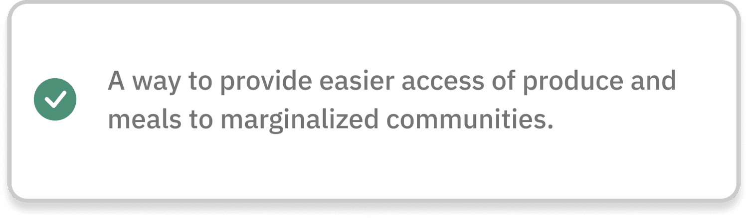
We've developed a mobile application that offers various delivery models to provide easier access to produce for marginalized communities:
Increasing time efficiency in obtaining and receiving food
Allowing customization of preferences
Offering affordable options for various healthy foods

Choosing a Topic
My team and I wanted to focus on food waste and food insecurities. We narrowed down the issue to one topic by asking ourselves …
“How do we reduce our waste in a way that benefits those who don’t have access to nutritious food?”
Using research from recent CDFA and USDA articles, I identified issues presented that include statistics for communities that are most affected by food deserts
Due to Covid-19, more people are struggling with food insecurity, which has led to poorer quality and less nutritious meals for many
The distance to a store is a significant barrier to those seeking healthier food options
With little access to healthy food options, the rates for disease are significantly higher in food insecure populations
User Research
We conducted 6 user interviews before app development to understand the ideal features for addressing food insecurity, especially during COVID-19. This provided deeper insights into users' shopping needs, habits, pandemic-related challenges, and motivations.

4 Key Insights
Insights from our User Interviews
We distilled insights from our user interviews into 8 main themes: convenience, shopping patterns, preferred stores, cooking routines, nutrition, cultural practices, challenges, and COVID-related food access. Crafting "how-might-we" questions from these, we refined insights to guide 4 solutions addressing user needs.


4 Key Insights
We brainstormed what type of services would best help those living with food insecurity, and we found that delivery services were most familiar and convenient for our users based on their responses and given the COVID-19 situation.
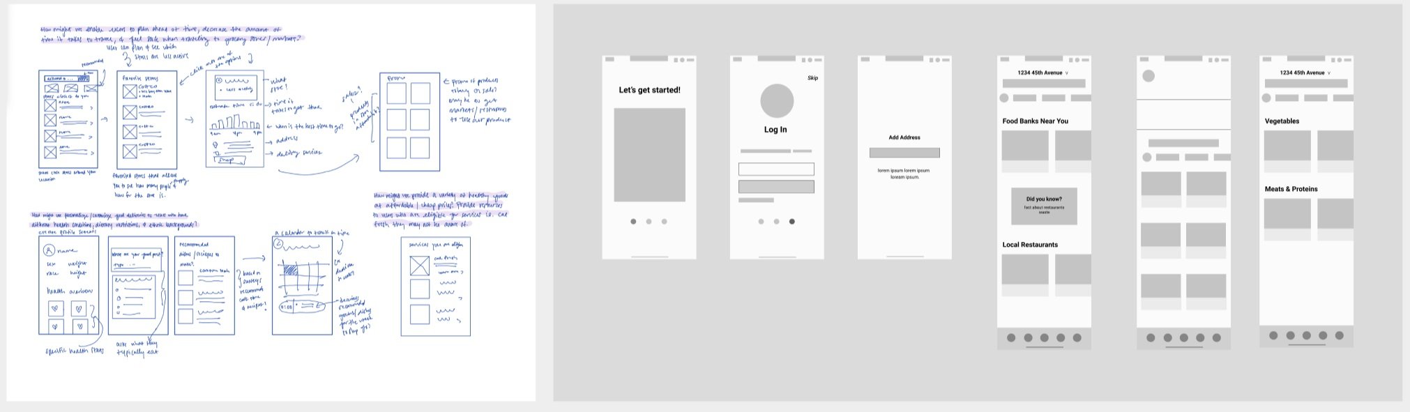
Wireframes
We brainstormed what type of services would best help those living with food insecurity, and we found that delivery services were most familiar and convenient for our users based on their responses and given the COVID-19 situation.
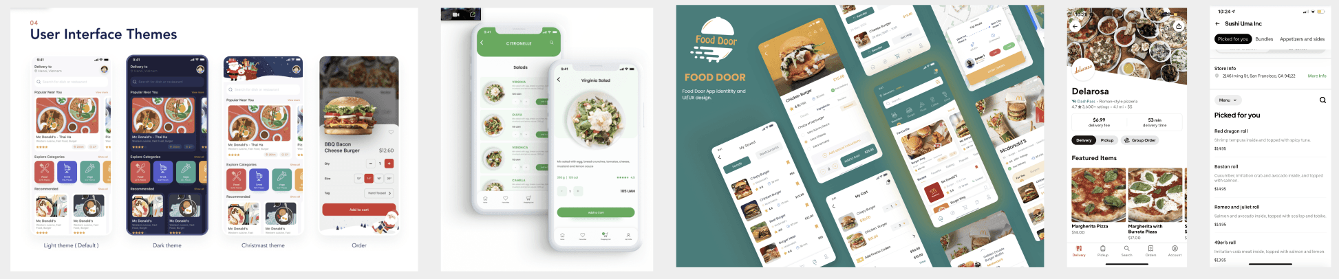
Style Guide

Final Designs
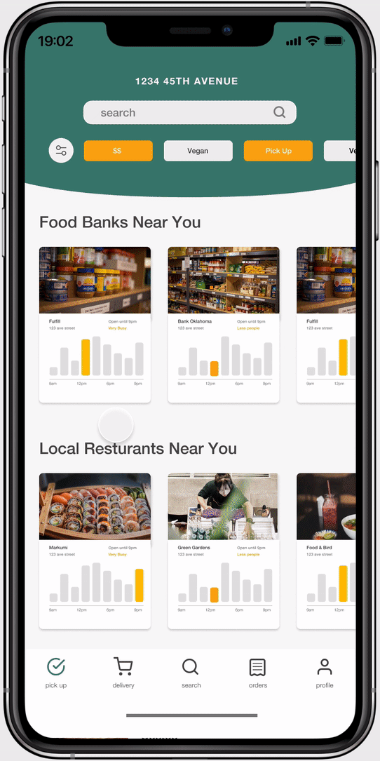
Streamlined onboarding introduces Commfoods' mission and promotes healthy food choices during the pandemic, complemented by engaging illustrations aligning with our accessibility goal.
Revamped homepage highlights local businesses and food banks offering surplus items across categories, prioritizing contactless shopping and economic choices based on user's location and algorithm.
Store pages spotlight cost-effective surplus inventory for user purchase, catering to bulk food and ingredient needs while addressing heightened delivery expenses.
Challenges
Within tight deadlines, we balanced rapid app iterations, prioritizing between user testing and refining user flows.
How to quickly make design choices without user feedback and using various research materials
In my first experience mentoring a team and assuming a leadership role, I found fulfillment in guiding others through the research aspect of design, prioritizing essential insights. Additionally, I improved interface accessibility by implementing WCAG guidelines.
Next Steps
Conduct more research to create a quality rating system for a product listed and help customers make a more informed purchase choice
Consider the use of including expiration dates and the number of days the product was being sold for
More usability tests to see if the product would help customers and solve the food desert problem
Better adhere to the WCAG guidelines, as the yellow and white contrast is not high enough, and the fonts were too small