
Industry
Context
Design Interactive, a UX Consultancy at Davis, selects students to develop a range of projects, from passion endeavors to client work. My team, focusing on the redesign of the critique process, received accolades for Most Innovative UX and Audience Choice Awards
Design Prompt
Create a comfortable and benefical critique environment for design students to receive feedback on their projects in a desktop setting
UX Goals
We interpreted the design prompt and defined the following adjectives to translate our goals.
Comfortable - A space where students efficiently & transparently give feedback to other students in a remote setting
Beneficial - Able to receive feedback that can be used throughout the design project or beyond
Solution Preview
Before Critique
During Critique
Minimize the feeling of awkward silences
After Critique
Make referencing critique feedback easier
Timeline
During the 5-week sprint, we primarily focused on research and prototyping. We conducted continuous user research, particularly targeting our main user groups during ideation. A key component was integrating our user tests into our lo-fi iterations.

User Research
We swiftly surveyed 20 students to grasp their critique experience, while engaging in 4 one-on-one interviews with professors to delve deeper into their hosting experiences. Our objective: dissecting the strengths and weaknesses of both in-person and online environments for a comprehensive analysis.

Students found it engaging to track other groups' progress, gaining insight into project expectations and areas needing improvement. Professors' feedback proved clearer, highlighting flaws and providing clarifications. However, some students found the process lengthy and tiresome.

Synthesis
Based on our research, we identified numerous opportunities for our team. To organize our findings, I conducted affinity mapping to highlight common themes in our data.
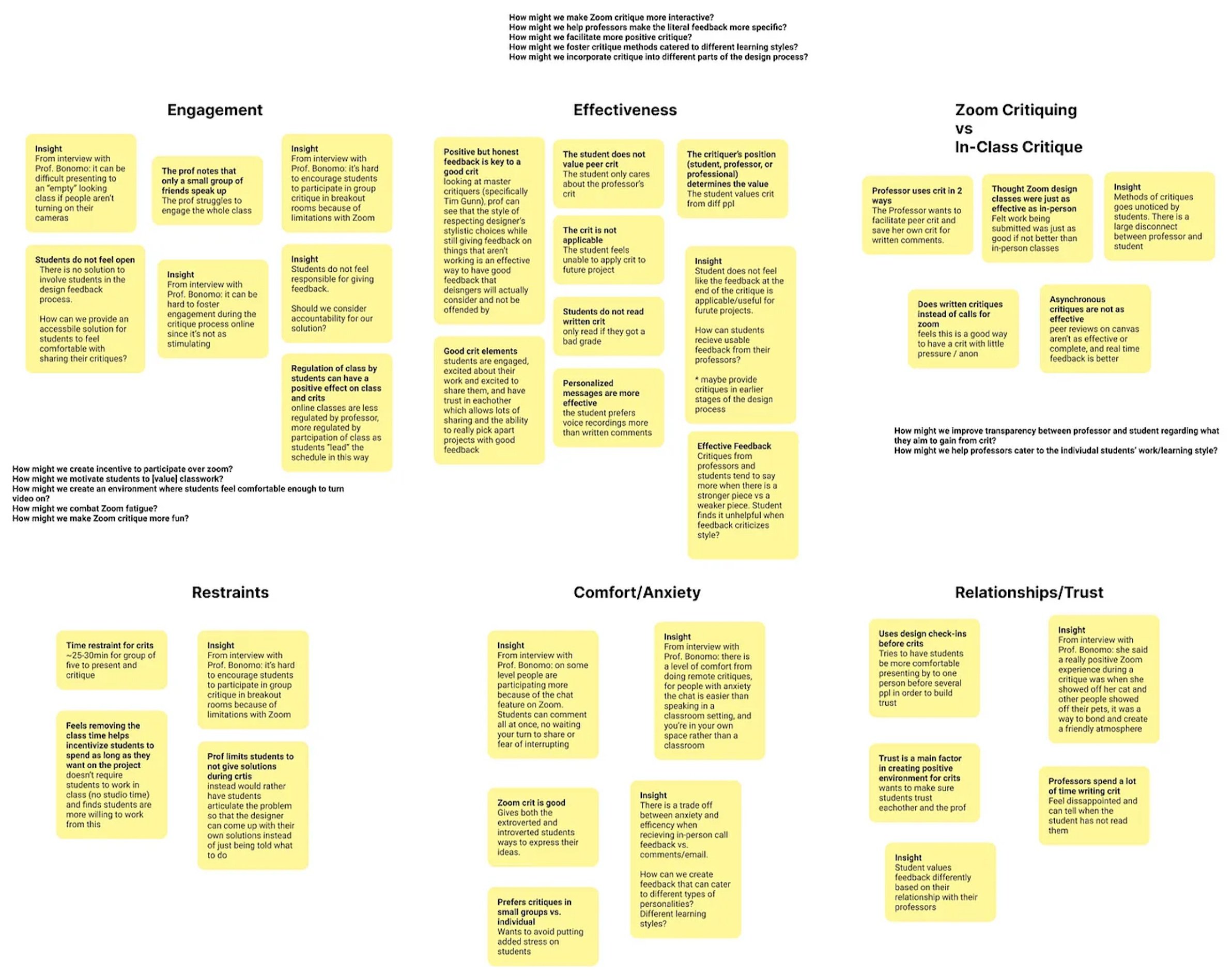
Main Findings
Our research led to the recognition of the remote critique experience as a multi-step process, which I termed the 'Critique Journey,' encompassing activities before, during, and after critique sessions.
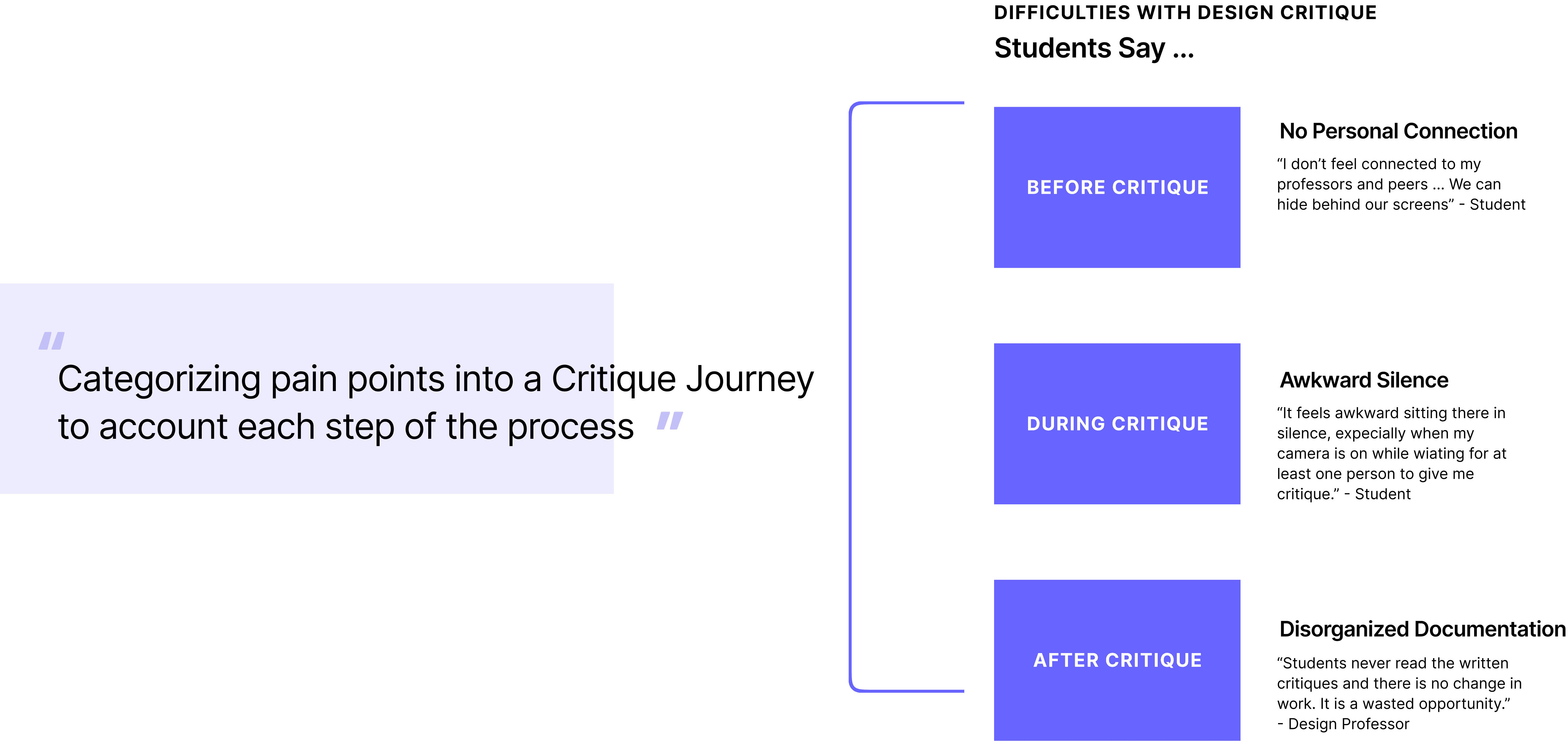
Step 1: Before Critique
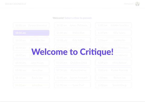
To enhance communication before critique, we introduced presentation time slots, eliminating ambiguity and anxiety. Through user testing, we discovered that our lobby screens lacked hierarchy, causing confusion among users. Consequently, we streamlined the pre-critique process into two clear steps: selecting a presentation time and answering an icebreaker question.


Before Critique: Final Iteration
We spent the majority of the 5-week sprint conducting research and prototyping. Our user research continued during our ideation process, allowing adequate time to dig deeper for our main user groups. A key component of our process was conducting user testing between our lo-fi iterations.
Students have varying comfort levels regarding microphone use.
Each professor has a different class structure, which affects the efficiency of critique. Students had varying experiences with whether or not critique sessions were done efficiently.


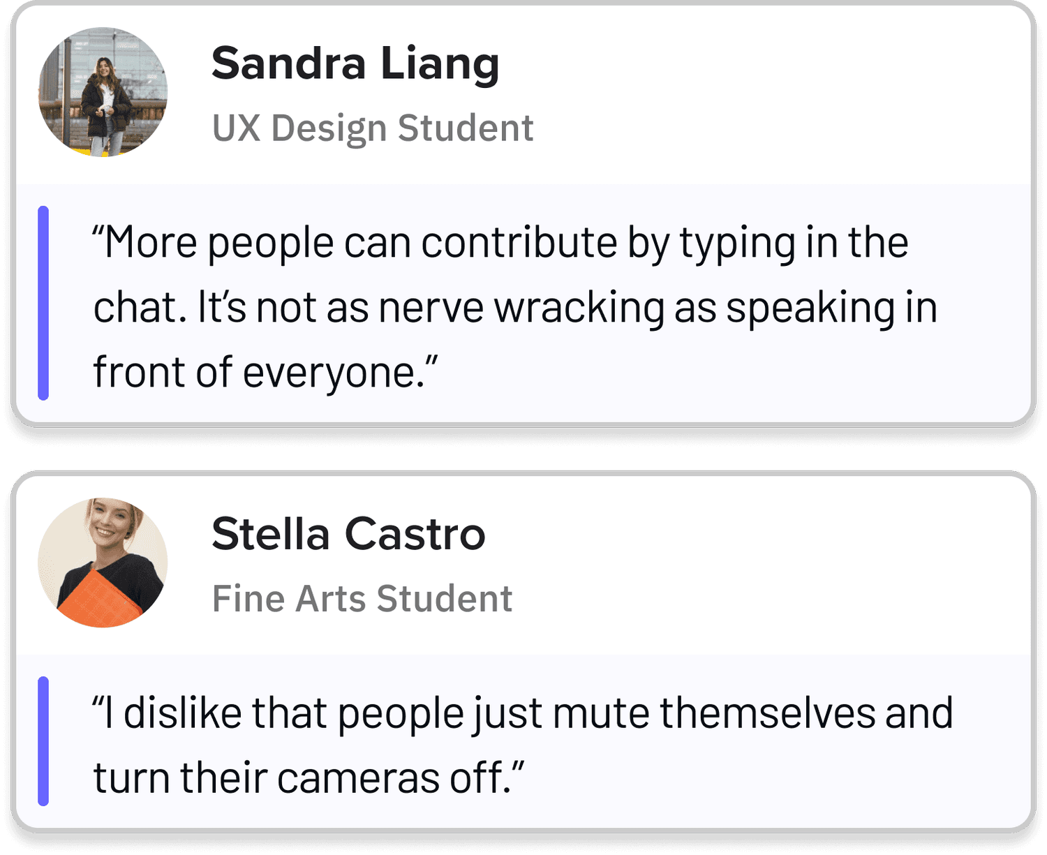
Students felt the text-based format of critique had both pros and cons.
Step 2: During Critique
We opted for emotes to enable audience members to express active engagement during critiques, similar to Instagram Live. These visible emotes aim to alleviate prolonged silences in a fun and encouraging manner.


User Testing
User testing revealed that public emotes made students more self-conscious about their work. To address this, we redefined emotes as static tools, akin to stickers, which students can place on artwork to indicate favorite areas. These stickers are visible only to the presenter, facilitating more personalized feedback without the need for peer comparison.

During Critique: Final Iteration
Users found the sticker function redundant and unintuitive, so I streamlined emotes to gather reactions to the overall piece rather than specific areas. Emotes were made subtler, with the option to hide chat and emotes for reduced distraction. Additionally, I limited emotes to positive choices to emphasize positive engagement with students' work.
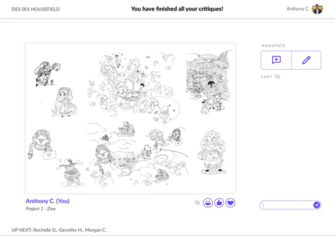
Step 3: After Critique
We consolidated all student feedback, including annotations, chat, and professor critiques, into a single document for easy post-class reference. During user testing, we encountered an edge case involving multiple annotations in the same area.


After Critique: Final Iteration
To address this, we merged annotations from the same area and included a filtering option for users to switch between text or hand-drawn annotations. Further user testing, especially with larger class sizes, would enhance this feature's effectiveness.

Final Design
Utilizing research insights, I crafted a design critique prototype enabling students to effortlessly schedule presentations, engage with icebreakers, and provide feedback using emotes, annotations, or drawing tools. Real-time interaction is facilitated through chat, with feedback seamlessly saved alongside the artwork. Distractions can be hidden during presentations for enhanced focus. Notifications are highlighted for easy identification, and messages can be saved for future reference. After class, all feedback, including professor critiques, is compiled into one document for simplified review, with filtering options provided.
Key Takeaways
During remote design critiques, users' diverse emotions pose a challenge for product design. I specialize in designing with a focus on user flow and emotions, incorporating diverse feedback. Our team's approach was recognized, winning both the Most Innovative UX and Audience Choice awards.
Next Steps
We want to explore and accommodate various learning styles, improve the professors’ experience conducting in-class critiques, and further refine the emotes and tests with a large audience. I would also want to improve the general UI of our project, as it could have more contrast and better readability!